
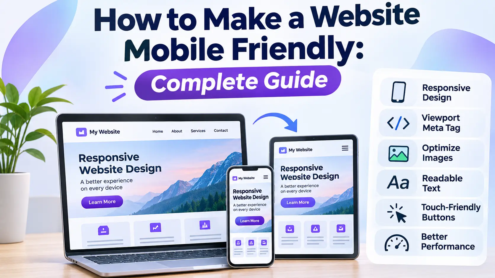
How to Make a Website Mobile Friendly: A Complete Step-by-Step Guide
Today, people access websites using smartphones, tablets, laptops, and desktop computers. A website that looks perfect on a desktop screen may become difficult to navigate on a smartphone if its layout, images, text, and navigation are not properly optimized. Visitors may need to zoom in, scroll horizontally, or struggle to click small buttons.
Learning how to make a website mobile friendly is essential for improving user experience, accessibility, website performance, and search visibility. A mobile-friendly website automatically adjusts its layout to different screen sizes, making information easier to read and interactions easier to complete.
Fortunately, you do not need to rebuild your entire website to achieve a responsive design. By implementing responsive CSS, optimizing images, improving navigation, and testing different screen sizes, you can create a better mobile experience.
In this guide, you will learn practical methods to make an existing website mobile friendly, including HTML and CSS examples, WordPress optimization tips, performance improvements, and mobile SEO best practices.
What Is a Mobile-Friendly Website?
A mobile-friendly website is a website designed to provide a comfortable browsing experience on smartphones and other smaller screens. Its content, navigation, images, forms, and interactive elements adjust to the available screen space.
Instead of displaying a reduced desktop layout, a properly optimized mobile website rearranges its content to make important information accessible without unnecessary zooming or horizontal scrolling.
For example, a desktop website might display three product cards in one row. On a smartphone, those cards can automatically change into a single-column layout.
Some important characteristics of a mobile-friendly website include:
- Responsive layout: Content adjusts automatically to different screen sizes.
- Readable typography: Text remains comfortable to read without zooming.
- Touch-friendly navigation: Buttons and links are easy to tap.
- Optimized images: Images resize without breaking the page layout.
- Fast loading: Pages load efficiently on mobile connections.
- Accessible forms: Input fields and buttons work properly on touchscreens.
- Consistent content: Important information remains available across desktop and mobile devices.
Why Is Having a Mobile-Friendly Website Important?
Mobile optimisation is important because visitors expect websites to work properly regardless of the device they use. A poor mobile experience can make users leave before completing an important action, such as reading an article, purchasing a product, or submitting a contact form.
1. Improve User Experience
A responsive website makes browsing easier. Visitors can read articles, explore products, open menus, and complete forms without repeatedly zooming or adjusting the screen.
2. Support Google Mobile-First Indexing
Google primarily uses the mobile version of website content for indexing and ranking. This approach is known as mobile-first indexing.
Your mobile website should contain the same important content, headings, metadata, images, and structured data as its desktop counterpart. Hiding important information from mobile visitors can also affect how search engines understand your pages.
3. Improve Website Engagement
When visitors can easily navigate a website, they are more likely to explore additional pages, interact with content, and complete their intended actions.
4. Support Online Sales and Conversions
For eCommerce stores and digital marketplaces, mobile optimization is particularly important. Customers should be able to browse products, read descriptions, add items to their carts, and complete checkout without difficulty.
5. Improve Website Performance
Mobile optimisation encourages developers to remove unnecessary scripts, compress images, simplify layouts, and improve loading performance. These improvements can benefit visitors using desktop devices too.
How to Make a Website Mobile Friendly: 10 Practical Steps
Follow these steps to transform an existing website into a responsive and mobile-friendly experience.
Step 1: Add the Viewport Meta Tag
The viewport meta tag is one of the most important requirements for mobile-friendly web development.
Without the correct viewport configuration, mobile browsers may render a page using a wider desktop-style viewport, making text and other elements appear unnecessarily small.
Add the following code inside the <head> section of your HTML document:
<meta name="viewport" content="width=device-width, initial-scale=1.0">This tells the browser to match the page width to the device width and use an initial zoom level of 1.
If you are building a custom PHP website, place this tag in your shared header template so that it appears on every page.
Step 2: Use Responsive CSS and Flexible Layouts
Fixed-width layouts are a common reason websites break on smartphones. For example, a container with a fixed width of 1200 pixels may extend beyond the screen of a typical mobile device.
Instead of relying on fixed widths, use flexible layouts with percentages, CSS Grid, Flexbox, and appropriate maximum widths.
Example of a responsive container:
* {
    box-sizing: border-box;
}

.container {
    width: 100%;
    max-width: 1200px;
    margin: 0 auto;
    padding: 0 16px;
}

img {
    max-width: 100%;
    height: auto;
}
This CSS helps prevent common layout problems by ensuring that the container does not exceed its available width and images scale proportionally.
Step 3: Implement CSS Media Queries
CSS media queries allow you to change the appearance of a website depending on the available screen width and other device characteristics.
For example, you can display a three-column layout on larger screens and switch to a single-column layout on smaller devices.
Here is a practical example:
.product-grid {
    display: grid;
    grid-template-columns: repeat(3, minmax(0, 1fr));
    gap: 20px;
}

@media (max-width: 768px) {
    .product-grid {
        grid-template-columns: repeat(2, minmax(0, 1fr));
    }
}

@media (max-width: 480px) {
    .product-grid {
        grid-template-columns: 1fr;
        gap: 15px;
    }
}
In this example:
- Desktop screens display three columns.
- Tablet-sized screens display two columns.
- Smaller mobile screens display one column.
These are example breakpoints, not universal device sizes. Choose breakpoints based on where your actual content needs a layout adjustment.
Step 4: Make Website Navigation Mobile Friendly
Desktop navigation menus often contain multiple links arranged horizontally. These menus may not fit comfortably on smaller screens.
A mobile-friendly navigation system should provide a simple and accessible way to open and close the menu.
Consider implementing the following improvements:
- Use a compact hamburger menu where appropriate.
- Make navigation links easy to tap.
- Avoid placing too many links in a single row.
- Keep important navigation options easy to find.
- Make dropdown menus work with touch interactions.
- Provide clear visual feedback when a menu is opened.
Example of a simple responsive navigation layout:
<nav class="main-navigation">
    <a href="/" class="logo">My Website</a>

    <button class="menu-toggle"
            aria-label="Open navigation"
            aria-expanded="false"
            aria-controls="site-menu">
        ☰
    </button>

    <ul id="site-menu" class="menu">
        <li><a href="/">Home</a></li>
        <li><a href="/about">About</a></li>
        <li><a href="/services">Services</a></li>
        <li><a href="/contact">Contact</a></li>
    </ul>
</nav>
Remember that the button also needs JavaScript functionality to open and close the menu. Update its accessible label and aria-expanded state when the menu changes.
Step 5: Optimize Images for Mobile Devices
Large images can cause horizontal overflow and increase page loading time. Image optimization is therefore an important part of mobile website development.
Start by applying this CSS:
img,
video,
iframe {
    max-width: 100%;
}

img {
    height: auto;
}
You can also improve image delivery by:
- Using modern image formats such as WebP or AVIF when supported.
- Compressing images before uploading them.
- Using responsive image attributes such as
srcsetandsizes. - Adding descriptive alternative text.
- Using lazy loading for suitable below-the-fold images.
- Providing explicit image dimensions to reduce layout shifts.
Example of responsive image delivery:
<img
    src="image-800.webp"
    srcset="image-400.webp 400w,
            image-800.webp 800w,
            image-1200.webp 1200w"
    sizes="(max-width: 600px) 100vw,
           (max-width: 1000px) 80vw,
           800px"
    alt="Responsive website design example"
    width="800"
    height="500"
    loading="lazy">
For important images visible immediately when the page loads, avoid unnecessary lazy loading.
Step 6: Improve Font Sizes and Readability
Small text can make reading difficult on smartphones. Similarly, excessively large headings may occupy too much space and disrupt the page layout.
Use relative font units such as rem and responsive typography with CSS clamp().
html {
    font-size: 16px;
}

body {
    font-size: 1rem;
    line-height: 1.6;
}

h1 {
    font-size: clamp(1.8rem, 5vw, 2.8rem);
}

h2 {
    font-size: clamp(1.4rem, 4vw, 2rem);
}

p {
    margin-bottom: 1rem;
}
This approach allows text sizes to adapt to different viewport widths while maintaining a reasonable minimum and maximum size.
Also consider paragraph spacing, line length, contrast, and heading hierarchy to make long-form content easier to read.
Step 7: Make Buttons and Forms Touch Friendly
Buttons and form controls should be easy to use with fingers rather than requiring precise mouse movements.
Small clickable elements placed close together can create usability problems on touchscreen devices.
Improve your forms and buttons by following these practices:
- Provide sufficiently large touch targets.
- Maintain enough spacing between interactive elements.
- Use clear labels for input fields.
- Set appropriate input types for email, telephone, and number fields.
- Make error messages easy to understand.
- Ensure buttons have visible focus and interaction states.
Example:
.button,
input,
select,
textarea {
    max-width: 100%;
    font: inherit;
}

.button {
    min-height: 48px;
    padding: 12px 20px;
    border: 0;
    border-radius: 6px;
    cursor: pointer;
}

input,
select,
textarea {
    width: 100%;
    padding: 12px;
    margin-bottom: 16px;
}
Using a minimum target size around 48 CSS pixels is a useful touch-friendly design guideline, although exact requirements can depend on the accessibility standard being followed.
Step 8: Improve Mobile Website Loading Speed
A responsive layout alone does not guarantee a good mobile experience. Your website should also load efficiently, especially for visitors using slower internet connections.
Some practical performance improvements include:
- Enable browser caching.
- Compress HTML, CSS, and JavaScript files.
- Remove unused CSS and JavaScript.
- Optimize images and fonts.
- Reduce unnecessary third-party scripts.
- Use a reliable hosting environment.
- Consider a CDN to serve static resources efficiently.
- Reduce server response time.
Pay attention to Google's Core Web Vitals:
- Largest Contentful Paint (LCP): Measures loading performance. A good result is 2.5 seconds or less.
- Interaction to Next Paint (INP): Measures responsiveness. A good result is 200 milliseconds or less.
- Cumulative Layout Shift (CLS): Measures visual stability. A good result is 0.1 or less.
These metrics should be evaluated at the 75th percentile of page visits, separately for mobile and desktop where sufficient field data is available.
Step 9: Avoid Horizontal Scrolling and Fixed-Width Elements
Horizontal scrolling is one of the most noticeable signs of a poorly optimized mobile website.
It often happens because of oversized images, fixed-width containers, wide tables, long unbroken text, or elements that do not shrink properly.
Use this CSS as a starting point:
body {
    margin: 0;
    overflow-wrap: break-word;
}

.container {
    width: min(100% - 32px, 1200px);
    margin-inline: auto;
}

pre {
    max-width: 100%;
    overflow-x: auto;
}

table {
    max-width: 100%;
    border-collapse: collapse;
}

.table-wrapper {
    width: 100%;
    overflow-x: auto;
}
For large data tables, a contained horizontal scroll area can be more usable than forcing the entire page to scroll sideways. Make sure users can still access all the information.
Step 10: Test Your Website on Different Mobile Devices
Never assume that a website is mobile friendly simply because it looks correct in your desktop browser.
Test your website at multiple viewport widths and on actual smartphones whenever possible.
Check the following:
- Does the website fit the screen without unwanted horizontal scrolling?
- Are navigation menus working correctly?
- Can users read the content without zooming?
- Are images resizing properly?
- Do buttons and forms work with touch input?
- Are important page elements visible?
- Does the website load efficiently on mobile connections?
How to Make a WordPress Website Mobile Friendly
If you use WordPress, you can often make your website mobile friendly without writing a large amount of custom code.
WordPress provides themes and customization options that support responsive layouts. However, your chosen theme, plugins, page builder, and custom CSS can all affect the mobile experience.
1. Choose a Responsive WordPress Theme
Start with a responsive theme that supports modern mobile layouts.
Before installing a theme, preview its homepage, blog pages, navigation, and product pages on smaller screens.
2. Check Your Page Builder Settings
If you use Elementor, Gutenberg, or another page builder, review its responsive controls.
Check column stacking, element visibility, font sizes, spacing, image sizes, and mobile navigation.
3. Optimize WooCommerce Pages
For WooCommerce stores, make sure product cards, product galleries, prices, variation selectors, cart buttons, and checkout fields work properly on smartphones.
Pay special attention to the checkout process because a difficult mobile checkout can prevent customers from completing purchases.
4. Use Performance Optimization Carefully
WordPress caching and optimization plugins can help improve page performance. However, test your website after enabling CSS optimization, JavaScript delay, minification, or lazy loading. Incorrect settings can break menus, sliders, forms, and other interactive components.
5. Test Custom CSS
If you have customized your WordPress theme, inspect your additional CSS for fixed widths, oversized margins, absolute positioning, and elements that overflow smaller screens.
Make sure changes are tested on both desktop and mobile layouts before publishing.
Useful Tools to Test Mobile Website Compatibility
Several free tools can help identify responsive design, performance, and accessibility problems.
- Google PageSpeed Insights: Analyze mobile and desktop performance, Core Web Vitals, and optimization opportunities. Visit PageSpeed Insights.
- Chrome DevTools: Use device emulation to inspect responsive layouts, viewport sizes, and page behavior. Read the Device Mode documentation.
- Google Search Console: Monitor indexing, mobile-first indexing considerations, and website search performance. Open Search Console.
- Web.dev: Learn responsive design, accessibility, and performance best practices. Visit web.dev.
Note: Google's former standalone Mobile-Friendly Test tool has been retired. Use Chrome DevTools, PageSpeed Insights, and real-device testing instead.
Common Mobile Website Design Mistakes to Avoid
Even when a website uses responsive CSS, certain mistakes can make the mobile experience frustrating.
Using Fixed Pixel Widths Everywhere
Fixed-width elements can overflow small screens. Prefer flexible widths and max-width constraints where appropriate.
Displaying Too Many Popups
Large popups can cover most of a smartphone screen. Use appropriately sized dialogs and ensure visitors can easily close them.
Making Navigation Difficult
Do not force users to navigate complex desktop menus on small touchscreens. Use clear navigation patterns.
Using Oversized Images
Unoptimized images can increase loading time and create layout overflow. Resize and compress images appropriately.
Hiding Important Content on Mobile
Do not remove important article content, product information, or navigation elements just to simplify the mobile layout. Reorganize content while preserving its usefulness.
Ignoring Accessibility
Do not disable browser zoom or rely exclusively on color to communicate information. Provide readable text, accessible labels, keyboard navigation, and sufficient contrast.
Mobile-Friendly Website Checklist
Before publishing your website, use this checklist to review its mobile experience.
- Responsive viewport meta tag is configured.
- Website layout adjusts to different screen widths.
- CSS media queries are implemented where necessary.
- Images and videos fit their containers.
- Navigation menus work on touchscreens.
- Text is readable without unnecessary zooming.
- Buttons and form fields are easy to use.
- Important content is available on mobile.
- There is no unintended page-level horizontal scrolling.
- Core Web Vitals are monitored.
- Mobile and desktop metadata are consistent.
- Structured data is available and valid.
- Google can crawl important mobile resources.
- Real-device testing has been completed.
More details
Making a website mobile friendly is an important step toward building a modern, accessible, and user-focused online presence. A responsive website allows visitors to access your content comfortably, whether they are using smartphones, tablets, or desktop computers.
Start with the viewport meta tag, flexible CSS layouts, responsive images, and mobile-friendly navigation. Then improve typography, interactive elements, page performance, and accessibility. Finally, test your website on multiple screen sizes and real devices to identify problems before they affect visitors.
Remember that mobile optimization is not a one-time task. Regularly review your website's performance, update your theme and plugins, and test new pages to maintain a consistent experience across devices.
The best mobile-friendly website is one that allows every visitor to find information, navigate pages, and complete important actions without unnecessary effort.
Frequently Asked Questions
Q: How can I make my website mobile friendly?
Start by adding the viewport meta tag, using responsive CSS, optimizing images, implementing mobile-friendly navigation, and testing the website on different screen sizes. These steps can help make an existing website more usable on smartphones.
Q: Can I make an existing website responsive without rebuilding it?
Yes. In many cases, you can improve an existing website by updating its CSS, adjusting fixed-width layouts, adding media queries, and optimizing images. However, websites built around rigid layouts may require more extensive changes.
Q: What is the difference between responsive design and mobile-friendly design?
Responsive design is a development approach that allows a website layout to adapt to different screen sizes. Mobile-friendly design is a broader concept that includes responsive layouts, readable content, touch-friendly controls, accessibility, and good mobile performance.
Q: Is responsive design important for SEO?
Responsive design helps provide consistent content and metadata across devices. Google recommends responsive web design as an easier approach to implement and maintain. Mobile usability and content accessibility are also important considerations for mobile-first indexing.
Q: How do I check whether my website is mobile friendly?
You can use Chrome DevTools to simulate different screen sizes, PageSpeed Insights to analyze performance, and actual smartphones to test navigation, forms, images, and page layouts.
Q: Can WordPress websites be made mobile friendly?
Yes. Choose a responsive WordPress theme, configure page builder layouts, optimize images, review custom CSS, and test WooCommerce or other plugin interfaces on mobile devices.
Q: Does mobile-friendly design improve website speed?
Not automatically. Responsive design improves layout adaptability, but speed also depends on image sizes, server performance, caching, scripts, fonts, and other technical factors.
Q: What is mobile-first design?
Mobile-first design is an approach where developers begin by designing for smaller screens and progressively enhance the layout for larger devices. It encourages prioritizing essential content and functionality.





Discussion (0)
Join the Conversation
Please log in to post a comment.
Log In to Comment